Bartine Bakery
2026
Bartine Bakery
2026
Same subject, always a different work. Bartine Bakery’s new identity is an experiment in repetition.
ROLE & SERVICES
Visual Identity
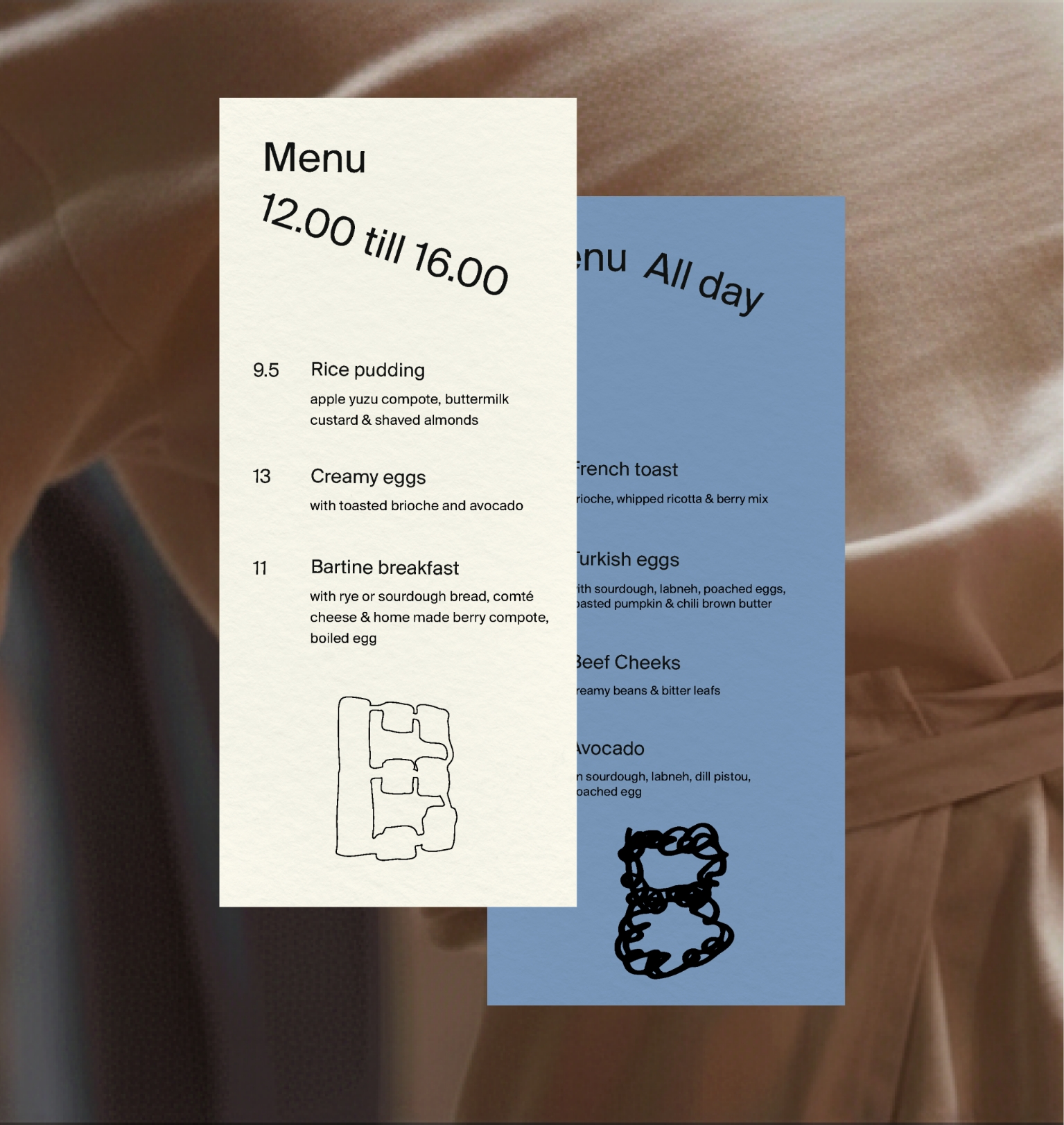
Print design
CREDITS
Handlettering:
Tom Vincentie
CLIENT
Bartine Bakery, The Hague
BRAND MARK
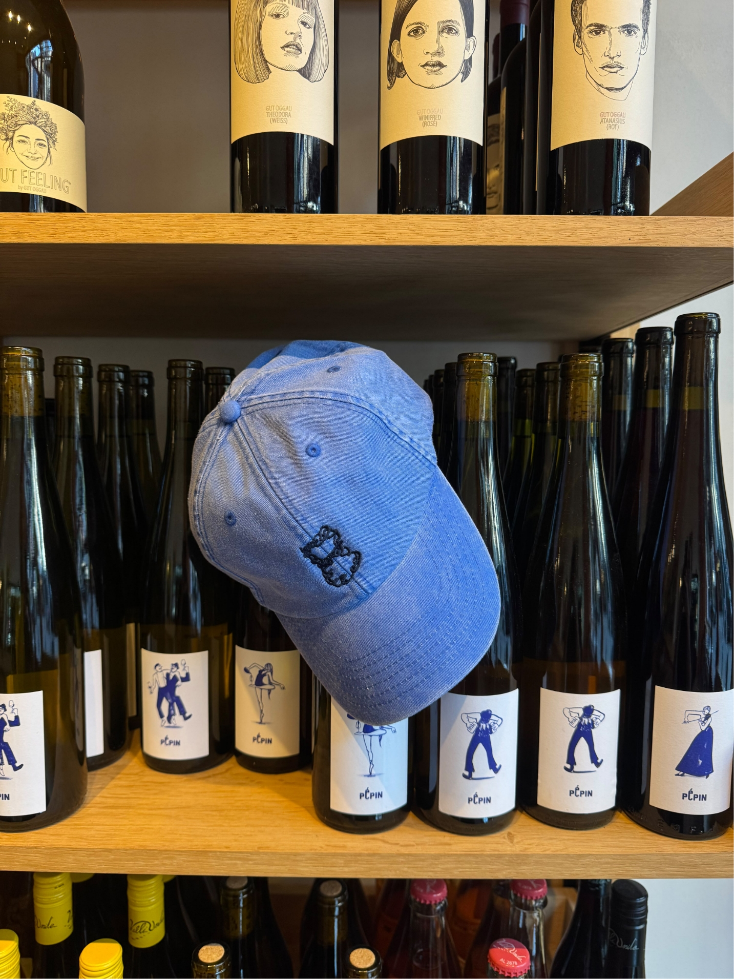
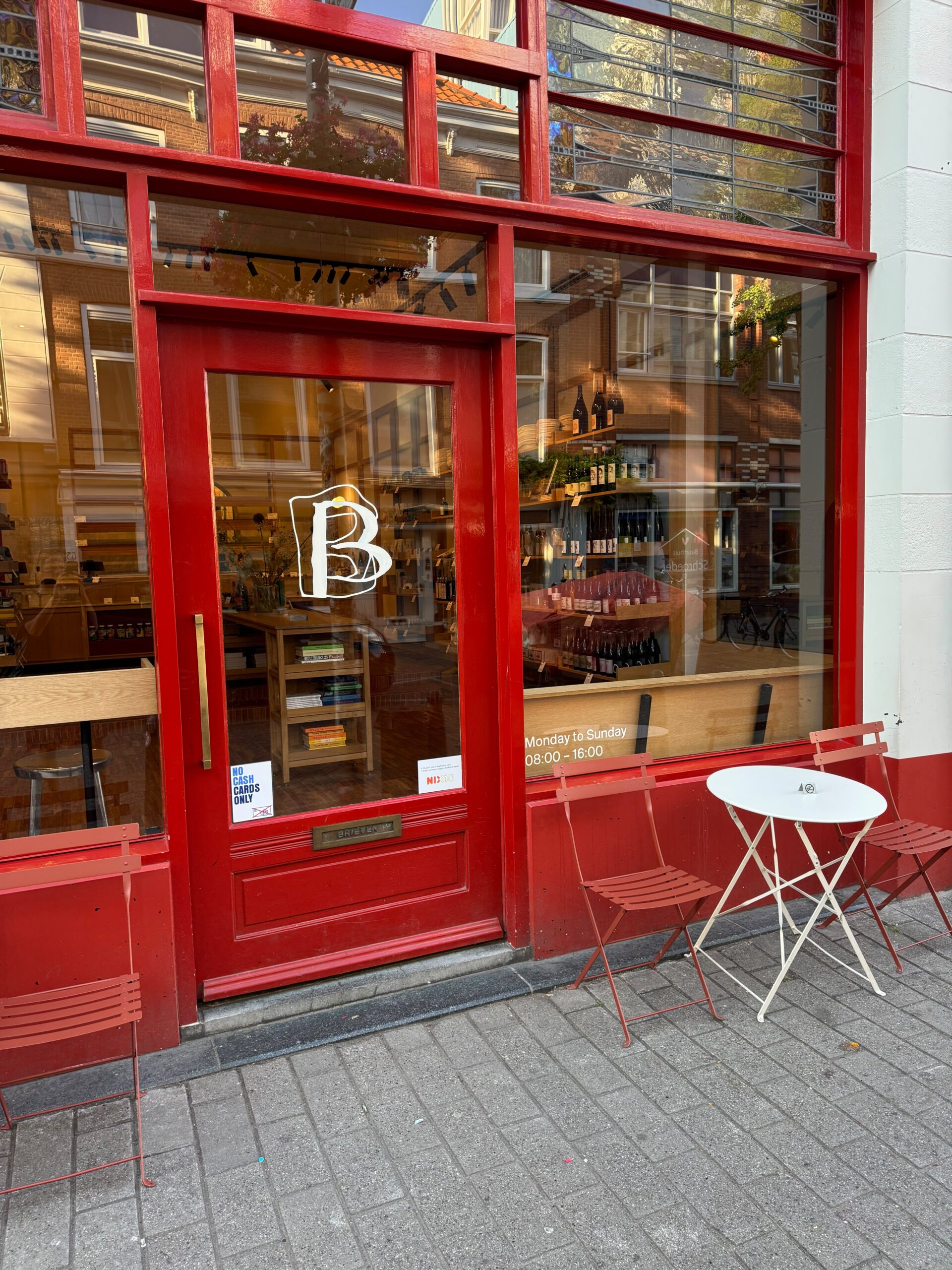
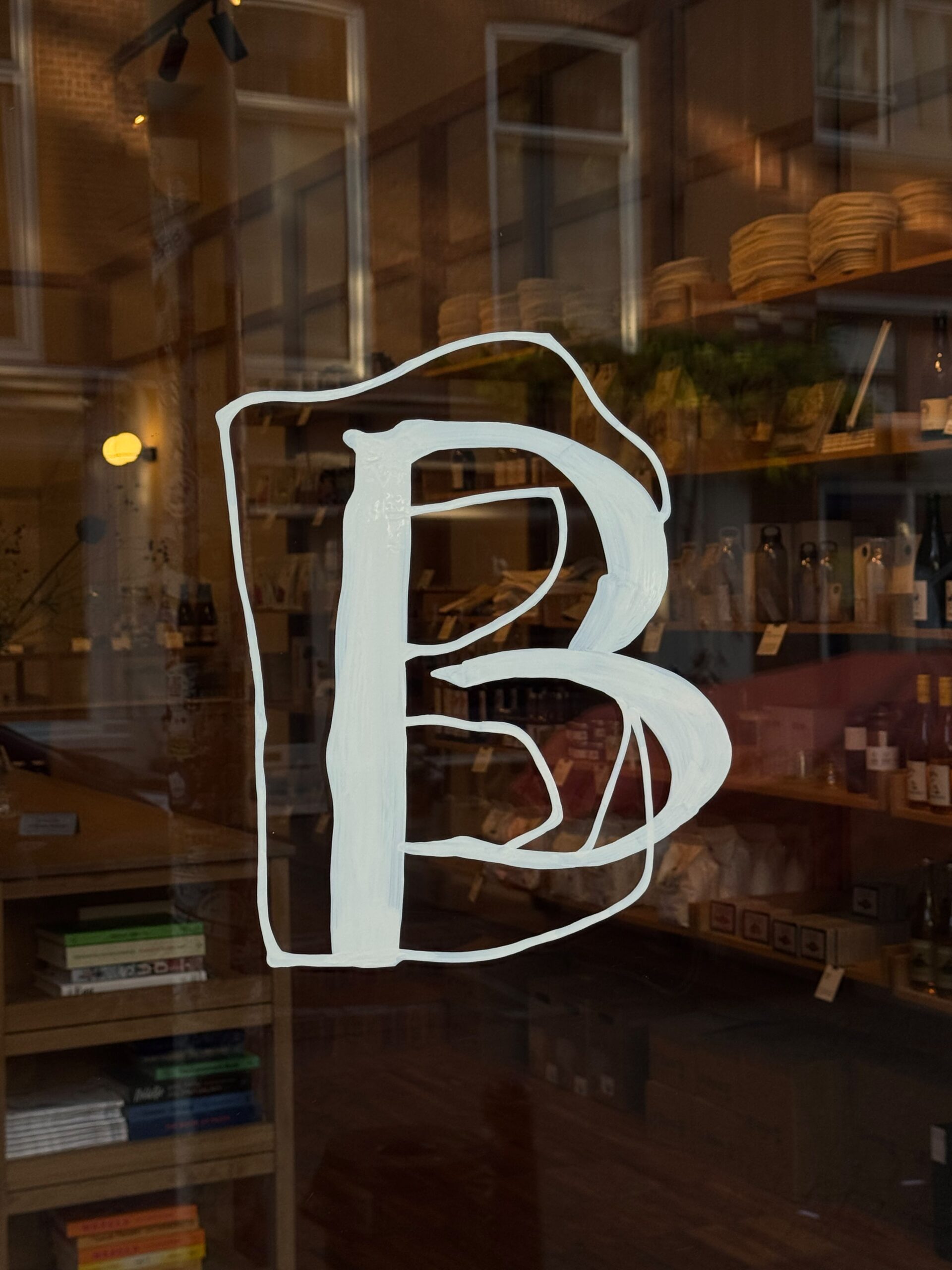
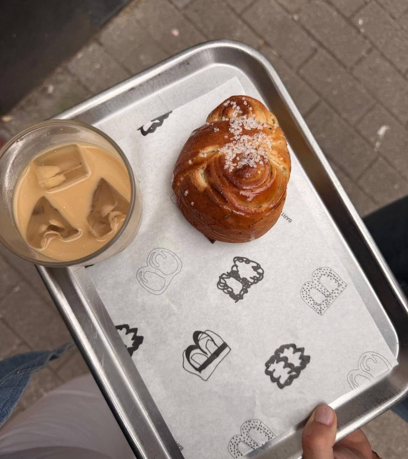
Bartine's new identity is led by a family of B's: a shape repeated, stretched and redrawn until it becomes something else entirely. An experiment in repetition. The further it ventures from home, the more recognizable the B will be: a core version of the logo, built for people who are less familiar with the brand. Get closer, and it loosens. Inside the shop, on a poster or a piece of merch, the B gets room to be abstract, illustrative, a little more playful. It changes, morphs and takes on new faces - a nod to Bartine's own refusal to stay just one thing.
APPROACH
Klaas Gubbels spent his career painting the same objects, a table, a coffee pot, a cup. Same subject. Always a different work. He believed the traces of making must stay visible. It is proof that something was made by hand, with intention, over time.
That is the philosophy behind the new Bartine identity.
TYPOGRAPHY
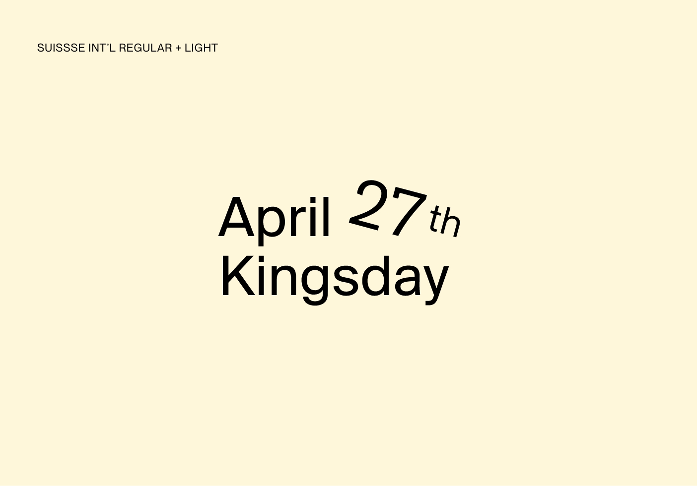
Suisse Int'l is the only typeface within the Bartine graphic language, chosen for its clarity, restraint, and refusal to decorate. A Swiss sans-serif that gets out of the way and lets the work speak.