Van Tilburg
2024
Van Tilburg
2024
Van Tilburg, the largest independent department store in the Netherlands, has been giving customers love for over a century. We had the honours of returning the favour.
ROLE & SERVICES
Visual identity
Copywriting
Campaign
Graphic Design
Web Design
APPROACH
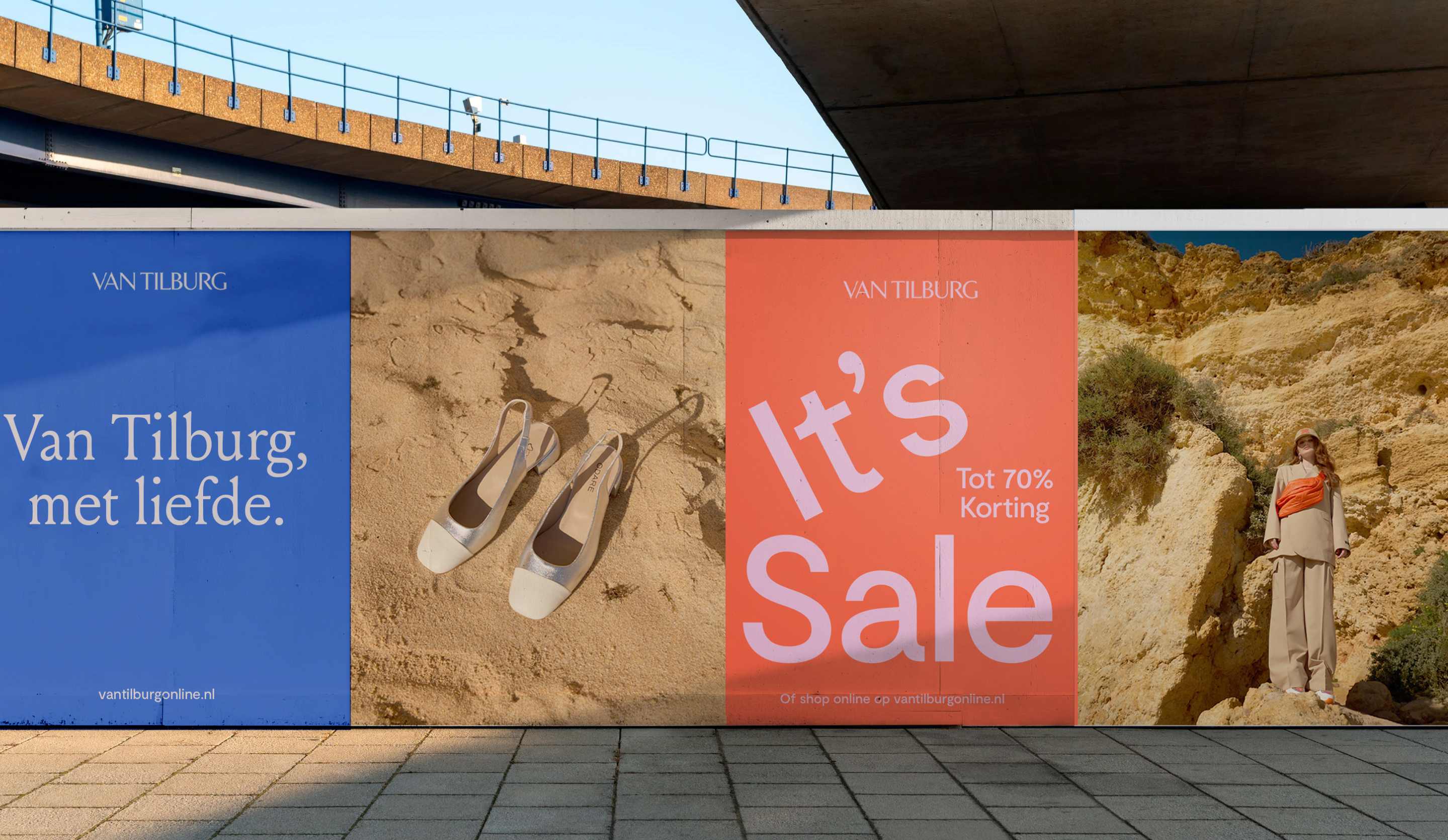
Honoring the past while embracing the future. Our approach was rooted in a deep admiration for Van Tilburg's legacy; we blended it with the dynamic of contemporary design trends to create a brand identity that resonates with both loyal customers and a new generation of shoppers.
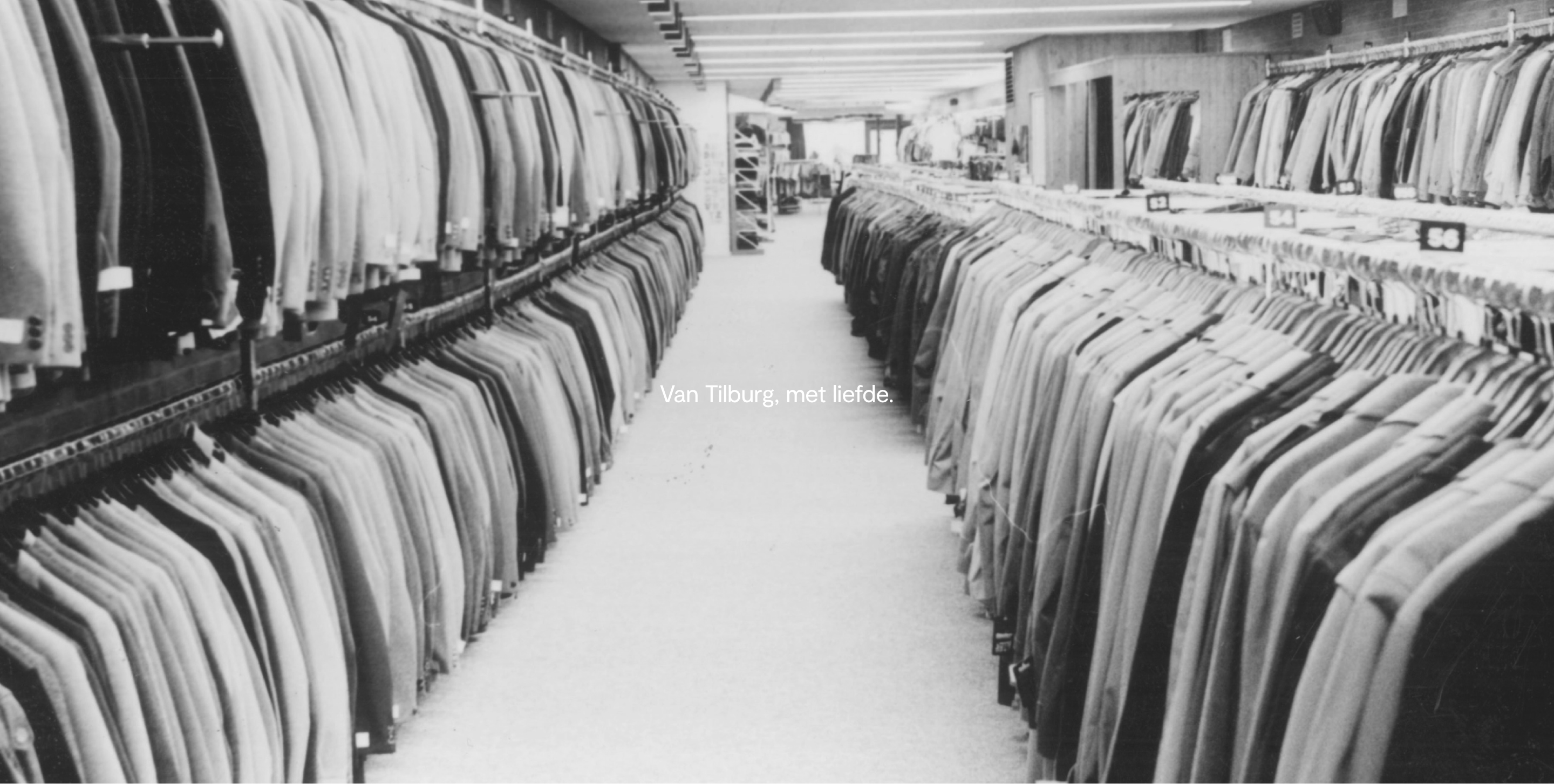
With a history that stretches back more than 170 years, Van Tilburg is a family business, known for exceptional service and personal care - values we have embodied in the concept of 'Van Tilburg, met liefde'.
With the foundation set, our vision was to infuse modernity into this storied brand. We selected a fresh and vibrant color palette aiming for an aesthetic that is both inviting and engaging.
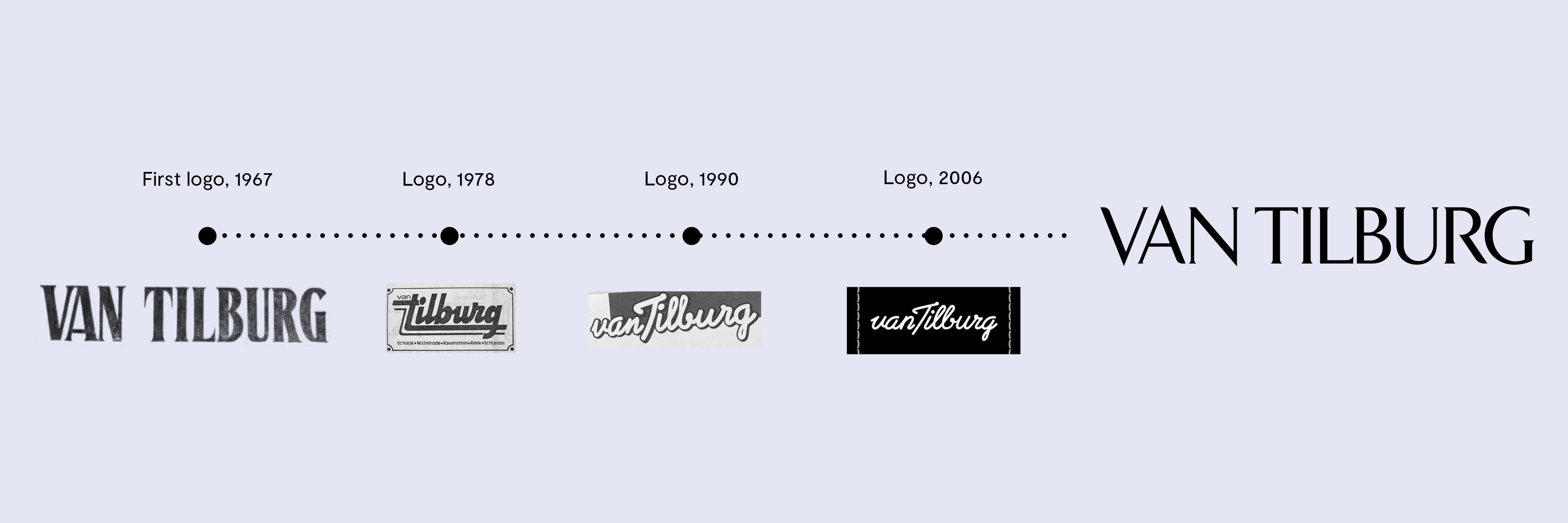
LOGO
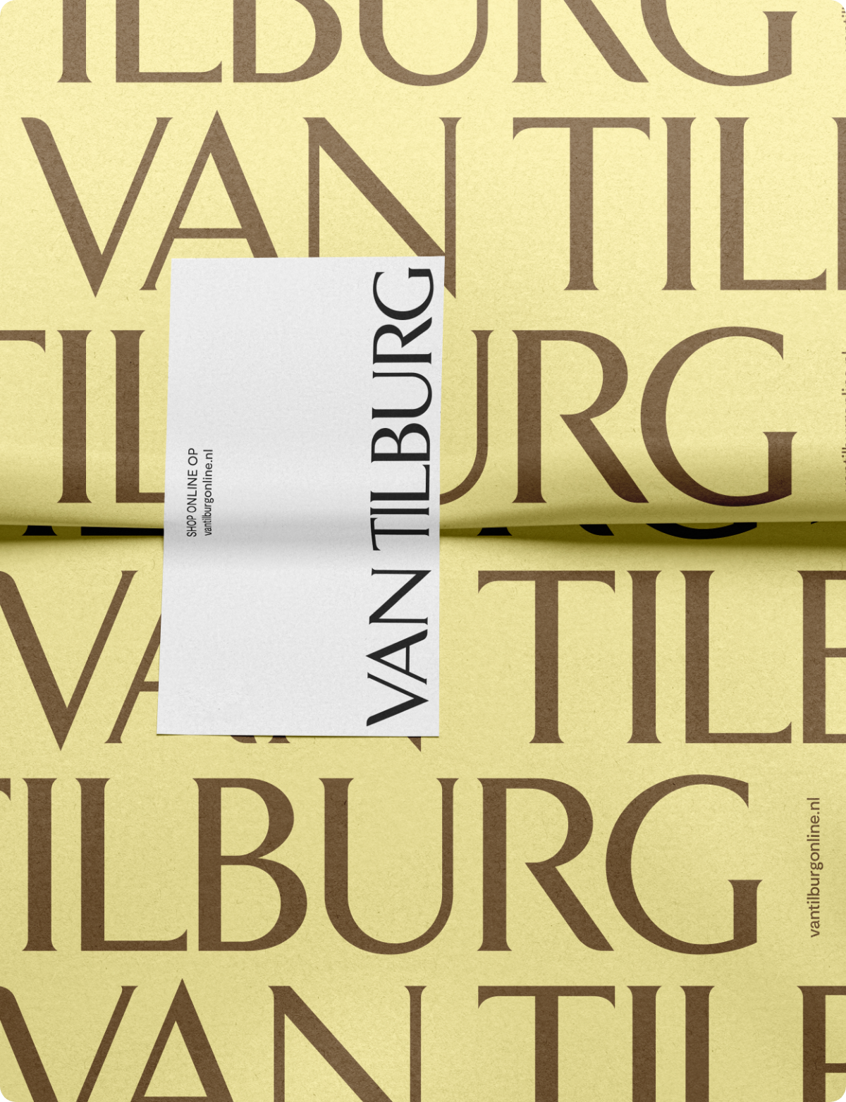
Our new logo takes inpsiration from a classic emblem created in 1967. It's not just a tribute to the past; it's a beacon for the future. Our design goal was simple: to blend tradition with modernity, honoring our roots while embracing the possibilities of now.
Van Tilburg Brand Video - created to share the new identity with staff and other internal stakeholders
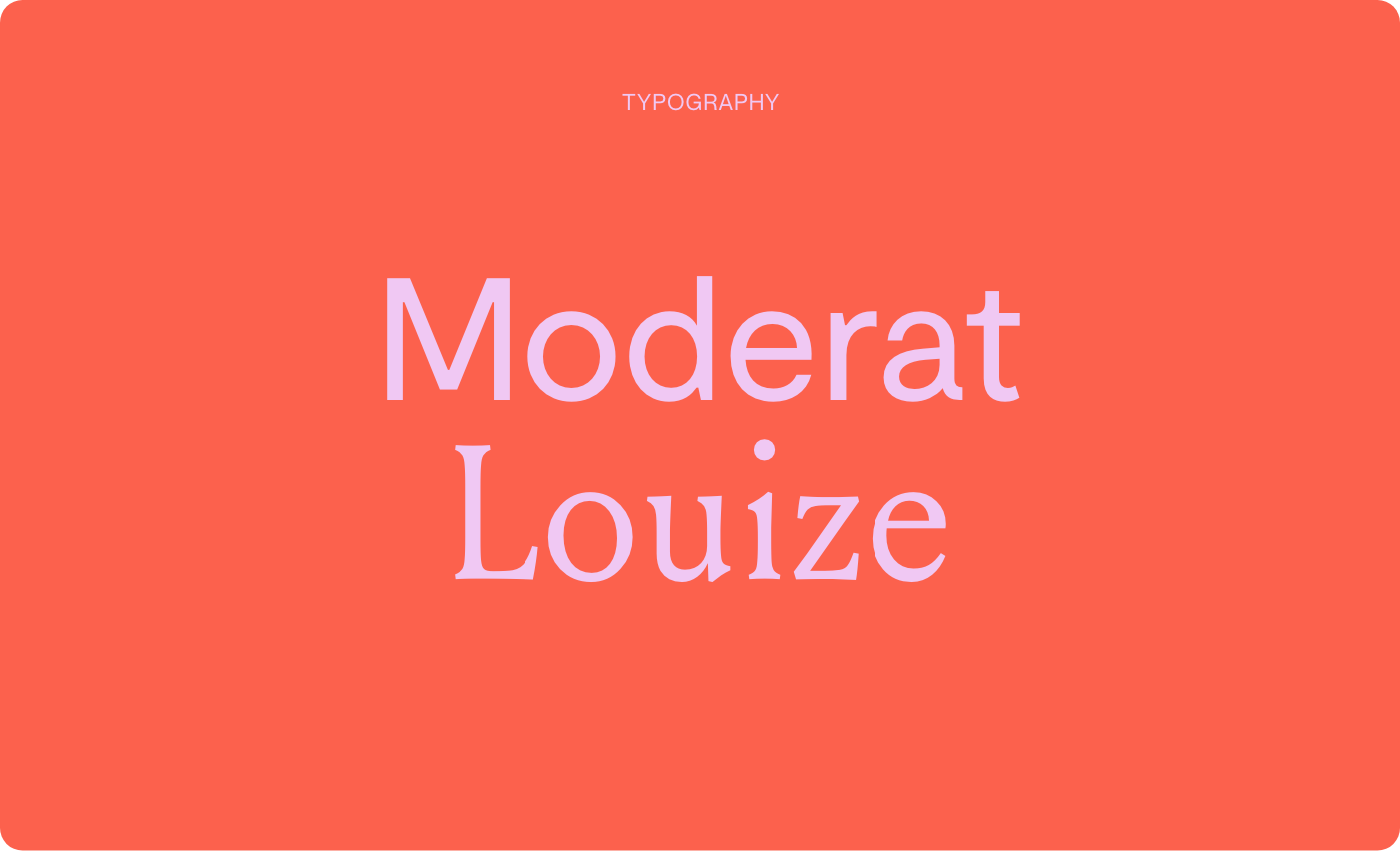
TYPOGRAPHY
Moderat Regular presents a balanced and contemporary appearance, making it the ideal choice for clear and direct messages. As a secondary typography, Louize Display introduces a hint of sophistication and character to the corporate identity.
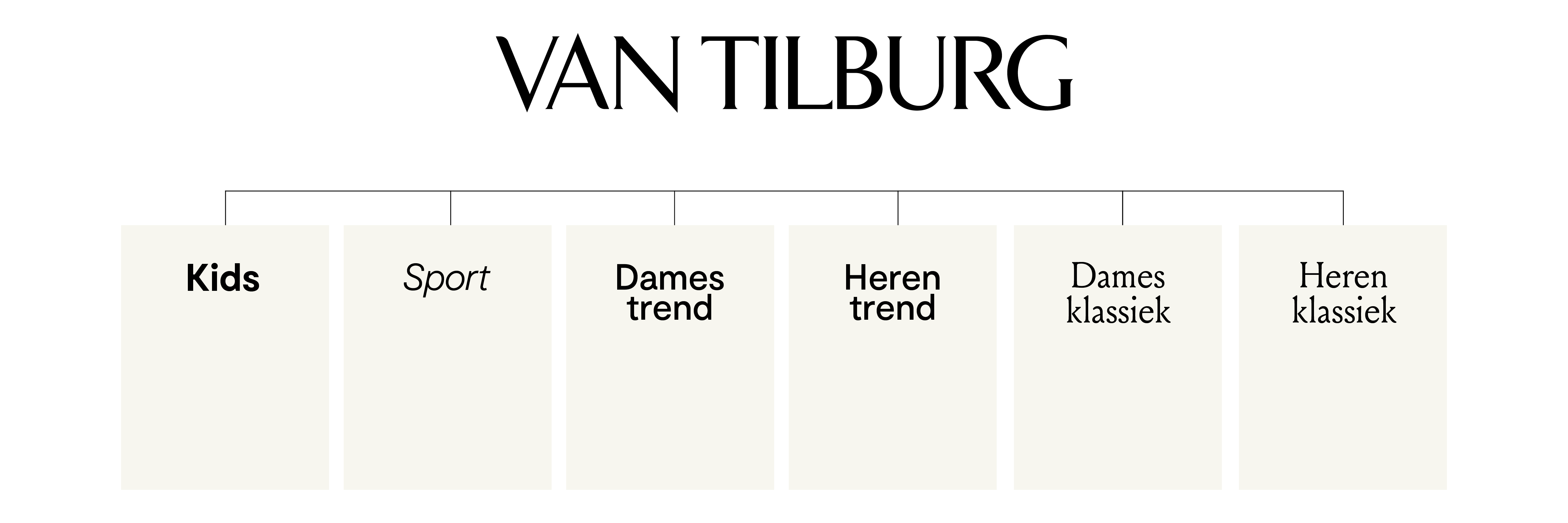
With customers spanning from 10 to 80 years old, our task was to create a system that effectively communicates with such diverse target groups. By blending timeless elegance with contemporary energy, our aim is to serve to all of them.
BRAND EXPRESSIONS
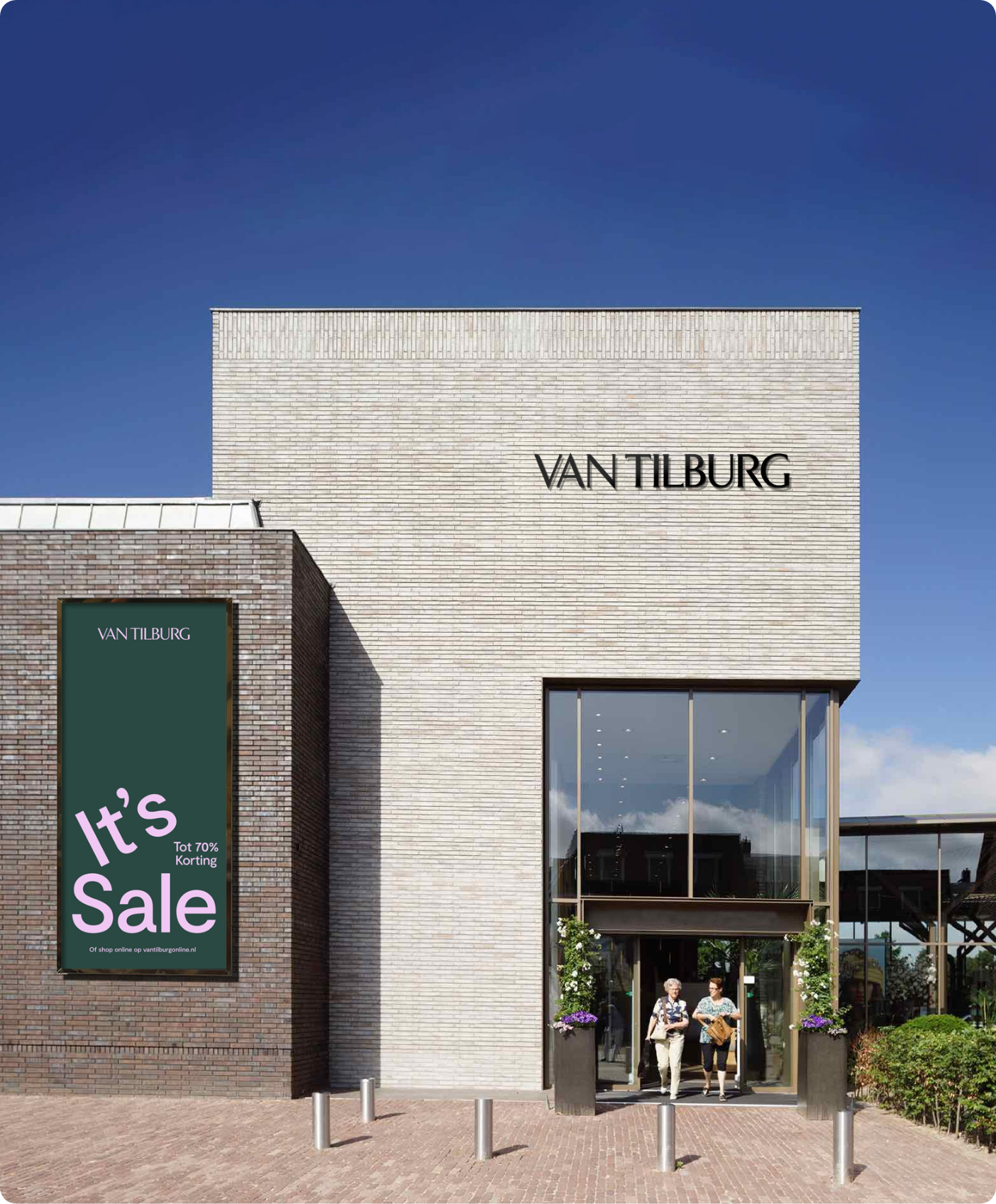
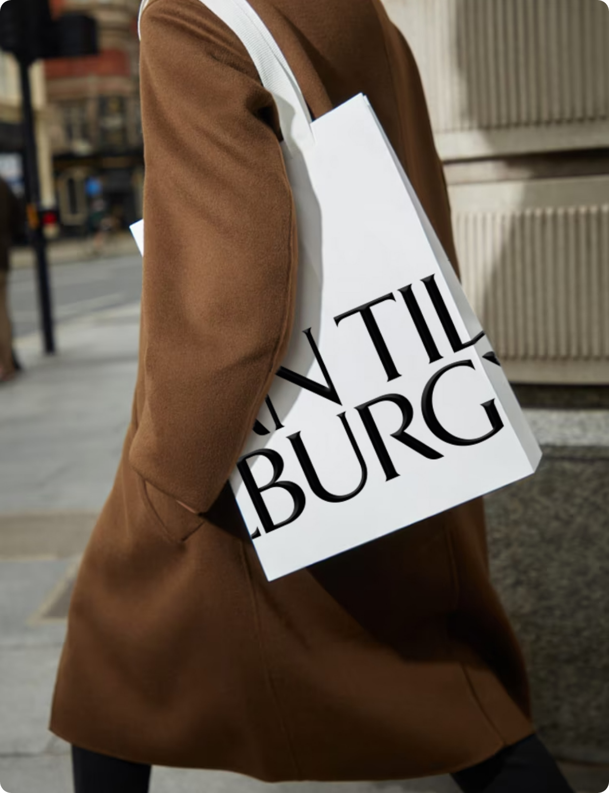
From in-store signage and campaigns to radio commercials, we worked on various creative expressions. A highly recognisable element within the identity is the large logo repeat-pattern. This graphic visual element enhances visibility on packaging and other print materials.
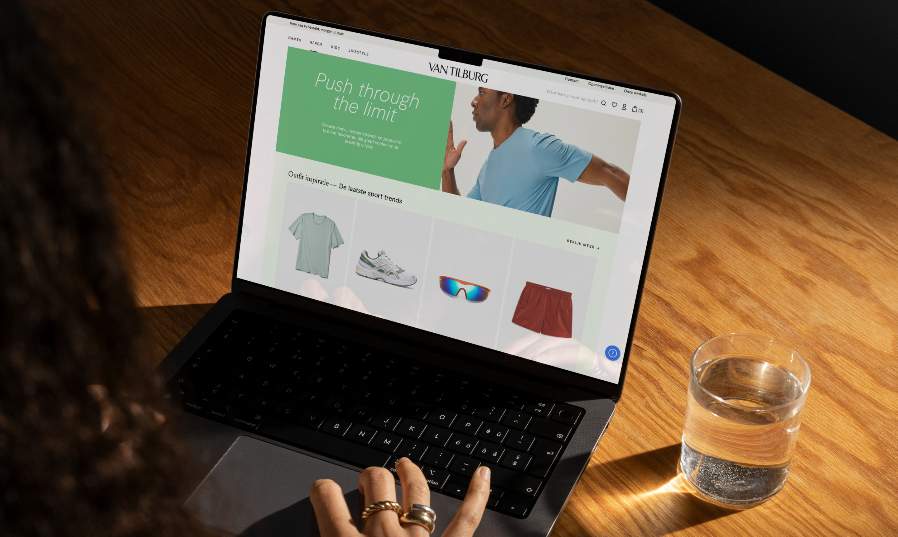
WEBSITE
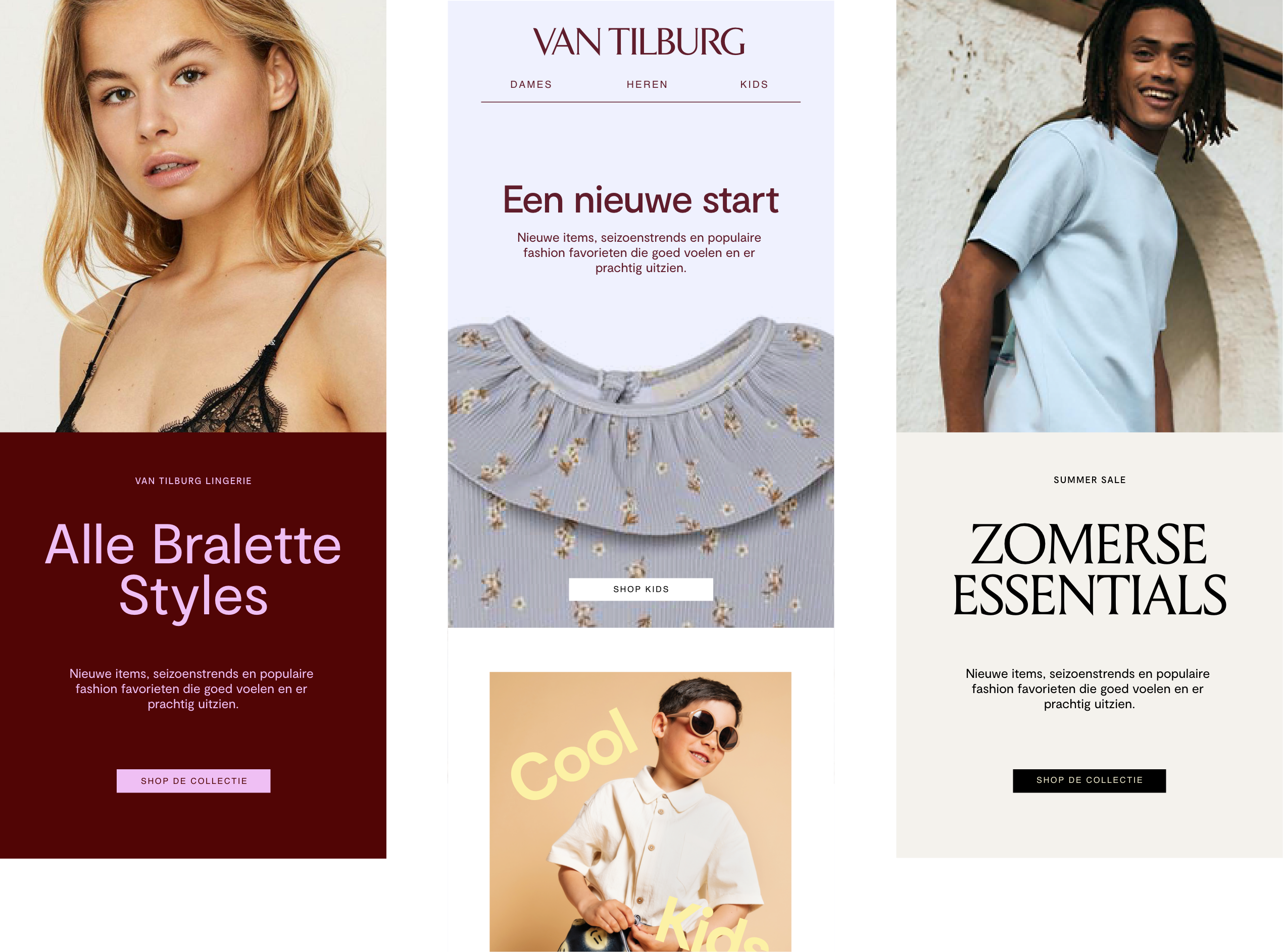
Focussing on harmonizing online and offline interactions, we created a modular ecommerce platform that's intuitive and perfectly syncs with Van Tilburg's refreshed identity. The platform, developped by Xsarus, leverages the Scayle ecommerce engine for an effortlessly fluid user experience.
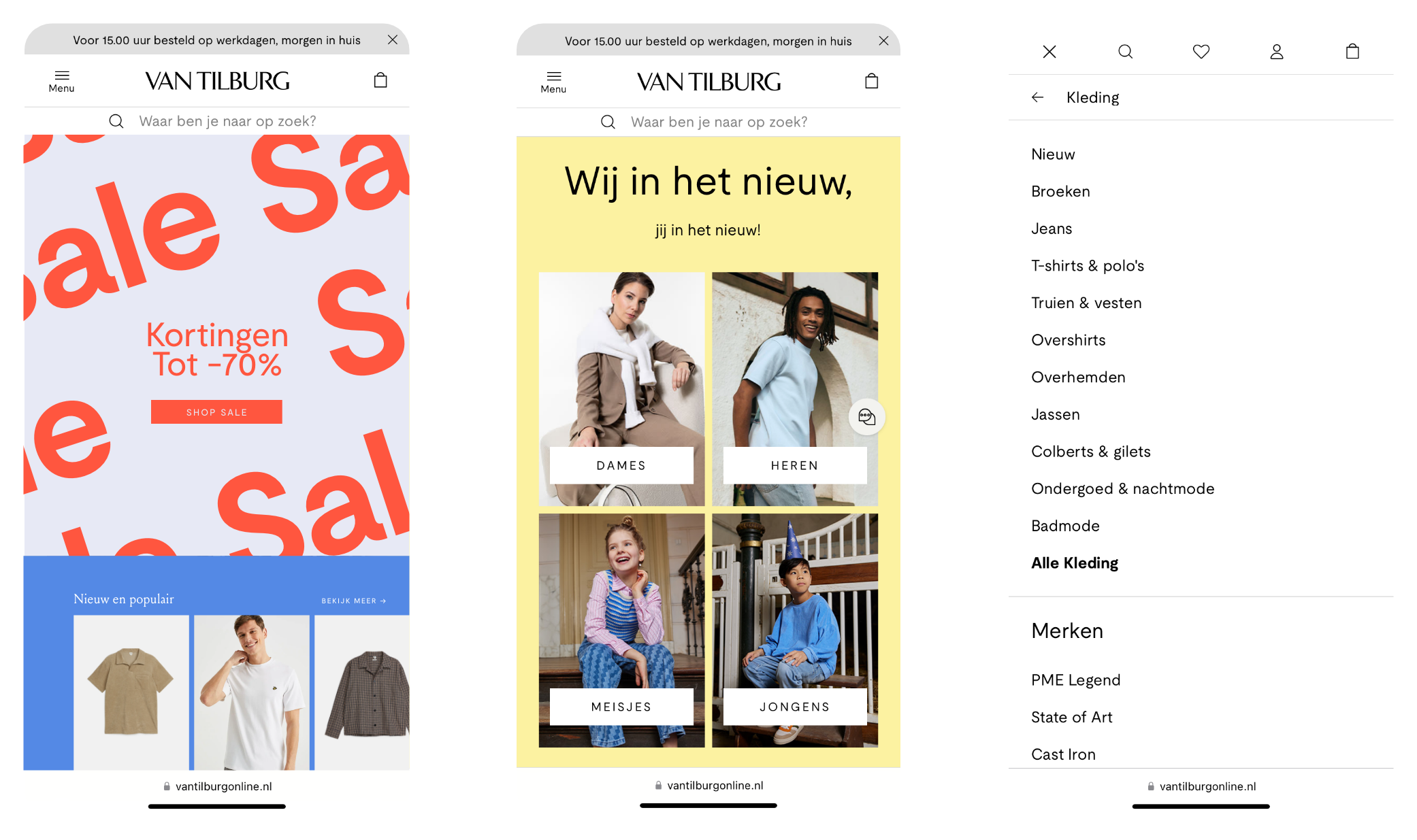
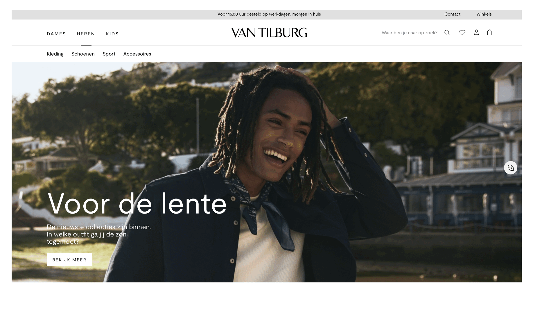
By carefully crafting the user interface and overall design, we strive to create an online shopping experience that allows the visitors to easily navigate throught the website.
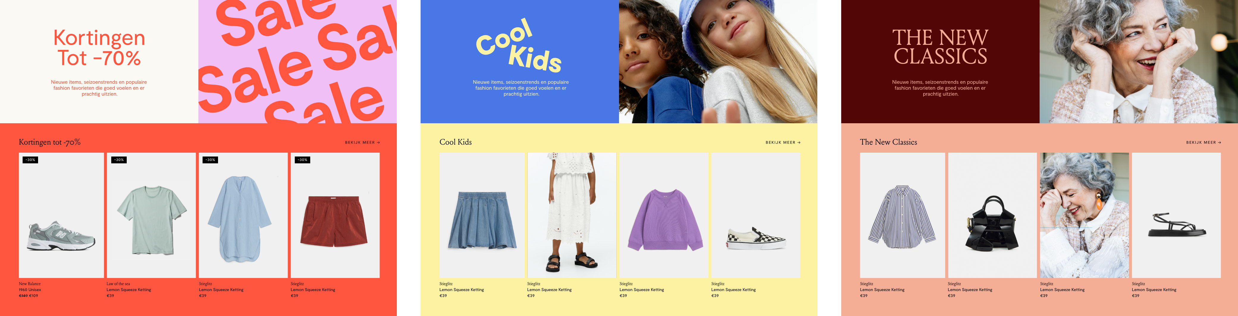
Within the modular design-system, we have developed custom templates for the different departments.
Every present needs a future. Let's reinvent reality together. Drop us a line
Explore More

Bringing local Dutch nature into your home with Ajen Botanical Body Care
Putting back the 'fun' in functionality for FEST Amsterdam